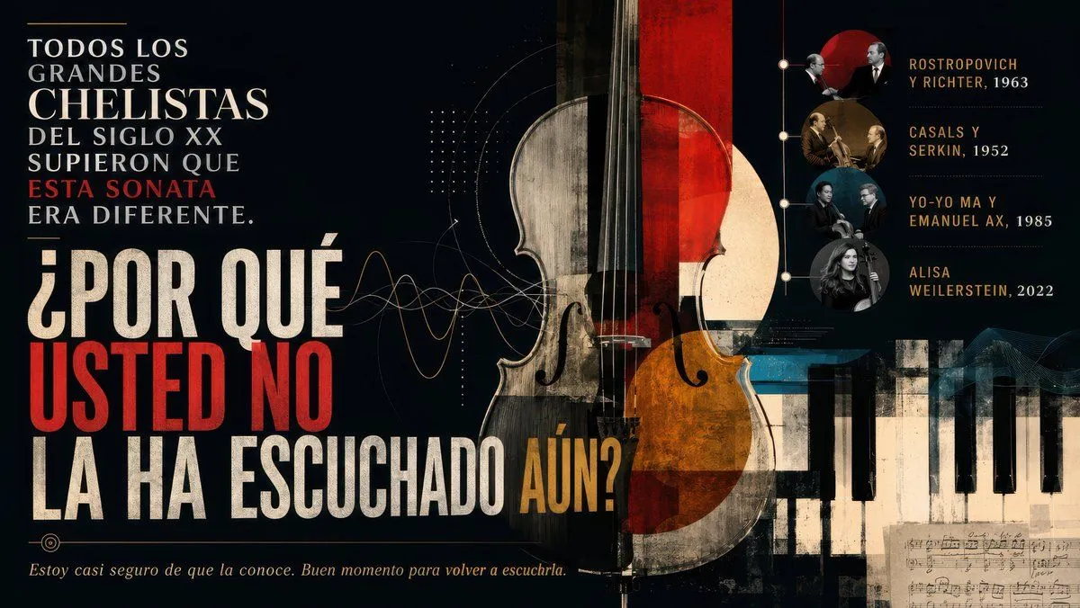
Dramatic Cello Sonata Poster
Goal: Create a dramatic widescreen editorial poster about a famous cello sonata and its legendary performers, in Spanish, with a classical-music documentary mood. Canvas: 16:9 horizontal poster, dark charcoal-black background, aged paper texture, high contrast, cinematic lighting, distressed ink and collage grain. Layout: Left third contains the main Spanish typography in stacked uppercase lines. Center features an oversized vertical cello collage, partly transparent and split into worn cream wood, black, deep red, and amber-orange geometric overlays. Bottom right contains a cropped piano keyboard extending horizontally, with a small fragment of handwritten sheet music beneath it. Right third contains a vertical timeline of recordings with exactly 4 circular musician-photo medallions connected by a thin vertical line and small nodes. Add subtle sound-wave curves, dotted grids, fine technical arcs, and faint music-staff textures around the cello. Text content: Use this exact main headline on the left, with mixed white, cream, red, and gold emphasis: “TODOS LOS GRANDES CHELISTAS DEL SIGLO XX SUPIERON QUE ESTA SONATA ERA DIFERENTE.” Then very large: “¿POR QUÉ USTED NO LA HA ESCUCHADO AÚN?” Make “USTED NO” bright red, “AÚN?” gold, and the rest distressed cream-white. Bottom left italic sentence: “Estoy casi seguro de que la conoce. Buen momento para volver a escucharla.” Right-side timeline: Include exactly 4 labeled recording entries, stacked vertically, each aligned to one circular portrait medallion: 1) “ROSTROPOVICH Y RICHTER, 1963”; 2) “CASALS Y SERKIN, 1952”; 3) “YO-YO MA Y EMANUEL AX, 1985”; 4) “ALISA WEILERSTEIN, 2022”. The medallions should look like archival classical-musician photos with muted sepia, black-and-white, and blue-gray tones; the final portrait can be a modern grayscale female cellist image. Visual style: Sophisticated museum-poster design, bold condensed serif and slab-serif typography, grunge print texture, vintage concert-program aesthetic, elegant gold accents, red circular sun shape behind the top timeline portraits, thin lines and dots like a music-analysis diagram. The cello should dominate the composition and overlap the typography slightly without making the text unreadable. Customizable parameters: The subject sentence may be main_claim; the large question may be headline_question; the closing line may be footer_quote; the instrument focus may be central_instrument; the timeline title names may be recording_list. Constraints: Keep all text legible and spelled exactly as specified, do not add extra recording entries, do not add logos or watermarks, maintain a dark refined classical-music poster atmosphere.