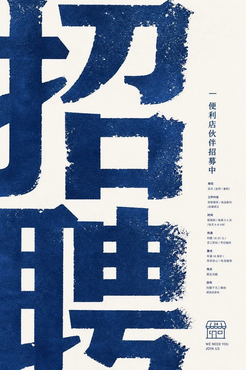
Distressed Convenience Store Recruitment Poster
Goal: Create a minimalist corporate recruitment poster for a convenience store partner hiring campaign, using a bold East Asian typographic aesthetic. Canvas: Vertical poster, 2:3 aspect ratio, warm off-white paper background with lots of negative space on the right. Layout: Fill the left 75% of the poster with enormous cropped dark-blue Chinese characters, reading like a giant recruitment headline main_headline; the characters are so large that their strokes extend beyond the poster edges. Place a narrow right-side information column centered vertically, aligned near the right margin. Add a small convenience-store line icon and English slogan at the lower right. Visual style: Rough risograph / screen-print texture, dark navy blue ink on cream paper, gritty distressed edges, speckled ink loss, slightly uneven stamped typography. Use a calm corporate poster composition, modern but tactile, no photos, no gradients, no extra colors. Text content: The poster contains exactly 1 giant cropped headline area, 1 vertical title line, 7 small information sections, and 1 bottom logo/slogan block. The vertical title line should read vertical_title. The 7 small sections in the right column are: 1) position: store staff, full-time or part-time; 2) work content: cashier operation, product display, store cleaning; 3) schedule: shift system, 3–5 days per week, 4–8 hours per day; 4) benefits: hourly wage 18–25 yuan, employee discount, holiday benefits; 5) requirements: age 18 or above, responsible, hardworking; 6) location: assigned nearby; 7) contact: scan the QR code below or visit the store to ask. Keep this body text very small, compact, and navy blue. Bottom block: Draw exactly 1 simple outlined convenience-store icon with an awning marked “24”, and below it place two short English lines: english_slogan_line_one and english_slogan_line_two. Constraints: Preserve the extreme scale contrast between the huge cropped blue headline and the tiny right-column details. Keep all typography and illustration in the same navy ink. Avoid realistic people, photos, decorative icons beyond the single store icon, QR code detail, shadows, or glossy effects.