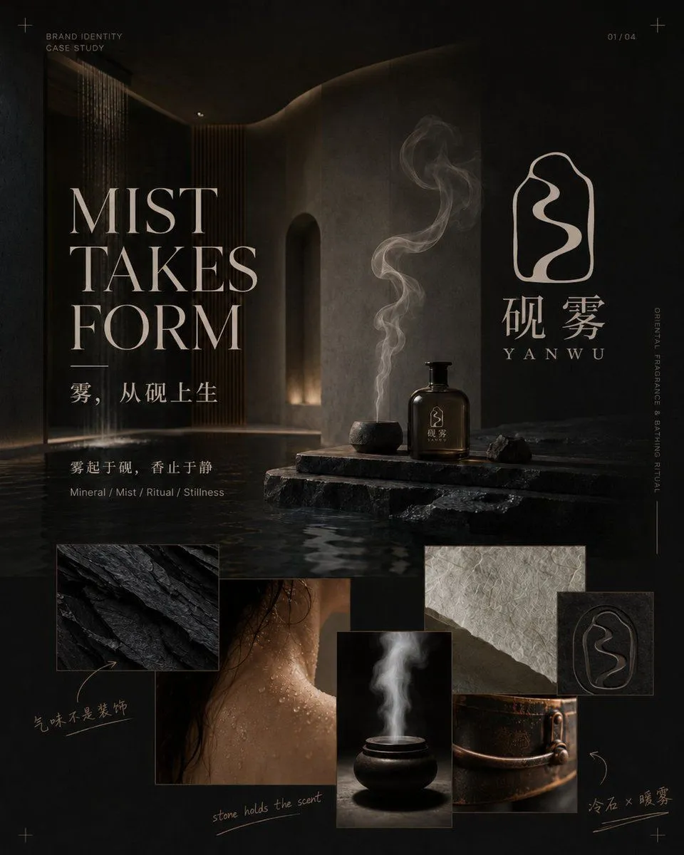
Dark Oriental Fragrance Brand Case Study
Goal: Create a premium brand identity case-study cover for an Eastern mineral incense/fragrance brand named brand_name, with a dark cinematic spa-temple atmosphere where mist, stone, ritual, and stillness define the brand world. Canvas: Square 1:1 presentation board, 1024 x 1024 style, deep charcoal and warm beige palette, luxury editorial layout, high-contrast low-key lighting, subtle film grain, refined typography. Layout: Top-left small label reads “BRAND IDENTITY / CASE STUDY”; top-right page marker reads “01 / 04”; add small registration cross marks in the corners. The left half contains a large elegant serif headline in three stacked lines: “MIST / TAKES / FORM”. Beneath it place the Chinese tagline “雾,从砚上生”, then a smaller sentence “雾起于砚,香止于静”, and a micro caption “Mineral / Mist / Ritual / Stillness”. The right half shows the brand symbol and logotype: an irregular rounded stone-outline icon containing a flowing mist-shaped stroke, with large Chinese characters “砚 雾” and spaced romanization “YANWU” below. Add a thin vertical side caption reading “ORIENTAL FRAGRANCE · BREATHING RITUAL”. Main image: Background is a dark architectural interior with water, black stone, curved concrete walls, a warm arched niche light, vertical wood slats, and a soft waterfall or rain curtain at far left. In the center-right foreground place a rough black stone platform emerging from shallow water. On it place exactly 3 main objects: 1 dark ceramic incense burner emitting a tall twisting column of white smoke, 1 amber-brown glass fragrance bottle with a black pump and tiny brand mark, and 1 small piece of black raw mineral rock. Make the smoke curl upward gracefully and echo the logo shape. Bottom collage: Add exactly 5 overlapping rectangular detail cards along the lower third: 1 close-up of layered black mineral stone, 1 close-up of wet skin or shoulder with water droplets and dark hair, 1 close-up of a black ceramic incense bowl with white smoke on black background, 1 close-up of cream handmade fibrous paper above a bronze/copper vessel, and 1 small square embossed black logo seal. Add handwritten annotation arrows in warm beige ink: near the black stone card write “气味不是装饰”; under the skin detail write “stone holds the scent”; near the bronze vessel write “冷石 × 暖雾”. Visual style: Sophisticated Chinese luxury branding proposal, contemplative and ritualistic, tactile materials, wet reflections, smoky depth, matte black stone, bronze warmth, beige typography, refined magazine grid, no bright colors, no people’s faces, no clutter. Text customization: The headline may be changed to headline_text; the Chinese tagline may be changed to chinese_tagline; the romanized brand name may be changed to romanized_brand_name; the page number may be changed to page_number. Constraints: Keep all visible text crisp and legible. Use exactly 5 bottom collage cards and exactly 3 objects on the stone platform. Preserve the luxurious dark editorial composition and avoid extra logos, watermarks, or unrelated text.