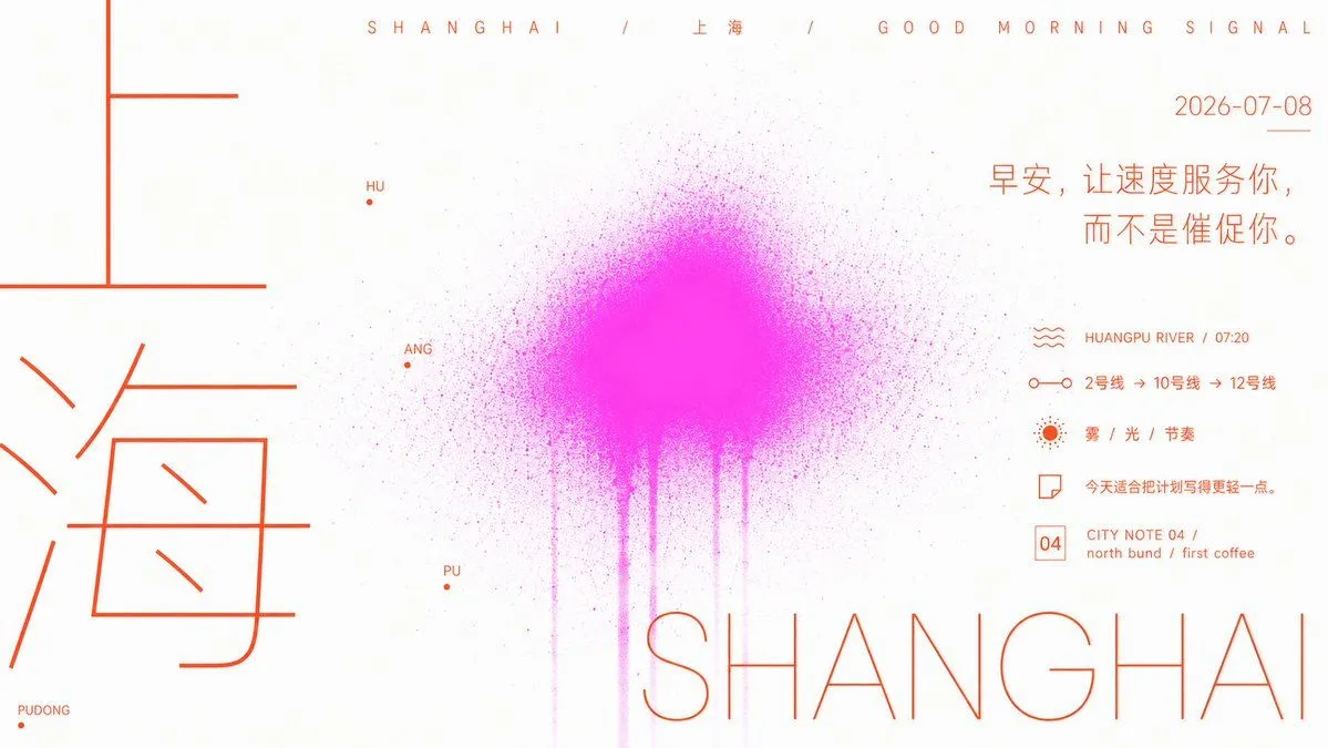
Bright Minimalist Poster with Linear Typography
Organize subject_content into a bright and clean flat poster. At first glance, the order is established by large areas of white space, thin-lined large characters, and a low-level diffusion of theme-colored spray. The image maintains a high-brightness background like a blank piece of paper. The main text appears in an extremely thin, uniform linear skeleton similar to engineering drawings. The character spacing is sparse but the scale jumps significantly: a small number of oversized characters are close to the edges to form a pillar-like visual weight, multilingual titles or subtitles hang horizontally above, and partial theme characters are disassembled and enlarged, appearing like logos or path nodes. Place a fluorescent mist block derived from the theme at the lower middle. The color is extracted from the theme's clearest, highest-brightness, and slightly acidic supporting colors. The center is fuller, and the edges dissipate outwards with a large number of tiny spray dots, vertically trailing several semi-transparent smoke pillars, making the text look like it is floating in front and behind the mist rather than pressed against the pattern. The text color uses high-saturation warm tones or theme-contrast colors clearly separated from the mist color, with a restrained area, serving as the unified voice for titles, descriptions, symbols, and bottom contact information; small characters are grouped in short lines, leaving wide room to breathe without filling the white space. All graphics maintain the flatness and cleanliness of digital printing, with only the edges of the spray appearing grainy, leaky, and of uneven density, avoiding heavy shadows, photo textures, gradient decorations, and crowded layouts; the final effect should be like an open field of characters in experimental communication, quiet, eye-catching, and slightly unstable. Each picture element: subject + 2026-07-08 + greeting + 5 different forms of information points + rich compositional rhythm changes 1 city each time, each city has different color matching logic and compositional logic changes A total of 10 cities, 10 images, generated in sequence Note: Each image has a different compositional layout. Ratio 16:9 Landscape