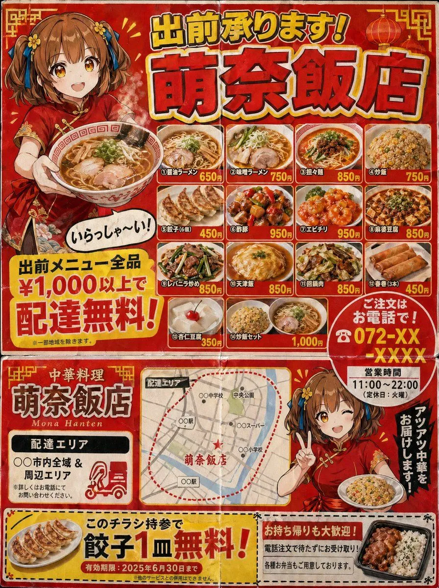
Authentic Japanese Delivery Flyer
A delivery flyer for a Japanese Chinese restaurant (3:4 aspect ratio). B5 size, double-sided style. Flyer characteristics (following the logic of real delivery flyers): - Loud red and yellow color scheme. - Large text at the top: "Delivery Available! restaurant_name" (shadowed Gothic font). - An illustration of a character holding ramen and saying "Welcome!" (with a speech bubble). - A menu photo grid (4x3) featuring various dishes: various ramen, fried rice, gyoza, sweet and sour pork, chili shrimp, mapo tofu, liver and leek stir-fry, tenshinhan, twice-cooked pork, spring rolls, annin tofu, and fried rice sets. - Name and price for each dish. - A large yellow banner saying "Free delivery for all orders over ¥1,000!". - "Order by phone! ☎ phone_number" highlighted with a red circle. - Business hours: "11:00-22:00 (Closed on Tuesdays)". - Delivery area map (simple schematic map). - Coupon (perforated line): "One free plate of gyoza with this flyer!". Cheap paper texture finish. Includes fold lines. High accuracy indistinguishable from real Japanese delivery flyers.