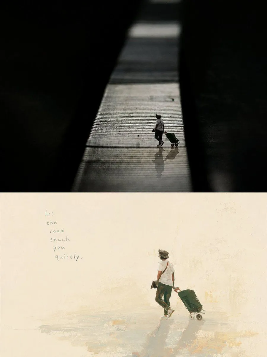
Artistic Memory Collage Poster
Please transform each photo I upload into an individual high-end design poster with a aspect_ratio vertical composition, following a dual-layer logic: the top half is realistic photography, while the bottom half is a painterly distillation of the original image's core imagery, creating an echo between reality and memory. The top half retains the original photo, maintaining subject identity, structure, posture, texture, and natural lighting, with subtle high-end photographic toning to evoke an independent art magazine or exhibition quality. The environment can be naturally extended to fit the frame, but the subject must not be distorted. The bottom half extracts the most recognizable **subject, outline, and narrative relationships** from the photo, reimagining only the most memorable information. Avoid full restoration of the scene; instead, focus on a single core subject with minimal narrative details, like a reorganized visual memory. The background of the bottom half should use **extremely light colors and large areas of negative space**. The background color should intelligently match the photo's temperature (e.g., warm white or cool off-white) to feel clean and quiet. This blank space should convey air, distance, and emotion. Emphasize **visual weight, negative space, and tension** in the composition. The subject can be offset or suspended to create beauty through contrast and scale. If the most moving part of the original photo is the distance between two objects, prioritize that relationship over individual detail. The painting style should use relaxed, naive artistic textures like **gouache, acrylic, and oil pastel**, with summary color blocks and hand-drawn outlines. Shapes can be slightly awkward or exaggerated, but the key posture must be accurate. Retain hand-painted traces like pauses and visible brushstrokes. The palette should be a **warm, bright, and naive artist's color scheme** extracted from the photo. Use warm blocks like warm_tones contrasted with cool_tones. Colors don't have to be realistic but must be harmonious, avoiding heavy Morandi grays or high-saturation digital hues. Text should be minimal and meaningful, generated based on the theme or emotion of the photo rather than fixed titles. Text can naturally enter the white space, appearing slightly hand-written or misplaced to maintain an artistic feel without looking like a mechanical advertisement. The overall goal is **minimal subjects, large white space, and warm hand-drawn aesthetic with clear visual metaphors**, resembling an independent publication hand-painted by an artist.