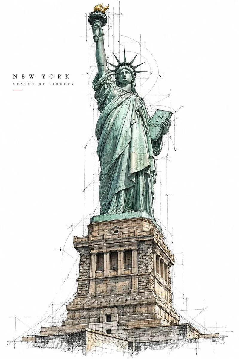
Architectural Master Sketch Poster
Create a premium 2:3 vertical architectural poster for location. TEXT-TO-IMAGE ONLY — generate the entire artwork creatively from location. No reference image required. CORE CONCEPT Present landmark as an expressive unfinished architectural master sketch, as if drawn by an architect exploring the building’s form, structure, and character. Keep the real architecture accurate — preserve its recognizable silhouette, proportions, façade rhythm, materials, and signature details. Do not redesign the landmark. COMPOSITION Show approximately 80–95% of the landmark from the most elegant and architecturally informative viewpoint for that specific building. Use a natural eye-level or gently elevated three-quarter perspective with realistic depth and restrained distortion. ONE LANDMARK ONLY. Let it dominate the composition while surrounding it with generous PURE WHITE negative space. No skyline or secondary landmarks. SKETCH STYLE Combine precise architectural ink drawing with loose unfinished concept-sketch elements: crisp black structural lines fine façade detailing varied line weights construction and perspective guides subtle drafting marks selective ink washes partially unfinished contours Some areas should be highly detailed while others naturally dissolve into loose exploratory lines and white space. It must feel genuinely hand-drawn, not like a 3D render with a sketch filter. DETAIL & COLOR Reveal authentic architectural elements such as structural connections, façade layers, openings, ornamentation, joints, and material textures. Never invent features that do not belong to the landmark. Use a PURE WHITE background with black and charcoal linework, plus ONE subtle accent color naturally derived from the landmark’s real materials. TYPOGRAPHY Optional small refined text in one corner: destination landmark_name Keep typography minimal and secondary to the architecture. FINAL AESTHETIC Architectural master sketch × technical drawing × expressive ink work × restrained hand-painted wash × contemporary collectible art poster. Avoid fictional architecture, incorrect proportions, extreme perspectives, close-ups, surrounding cityscapes, multiple landmarks, beige/aged paper, gradients, excessive colors, glossy 3D rendering, oversized typography, logos, and watermarks. FORMAT 2:3 vertical, single landmark, full architectural form clearly visible, generous white space, intricate linework, natural perspective, premium gallery-quality finish.