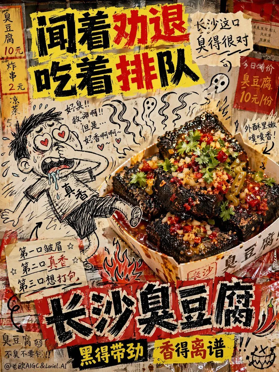
Anti-Design Stinky Tofu Advertisement
Creative composite street-food advertisement for Changsha stinky tofu, 16:9 horizontal aspect ratio, intentionally ugly anti-design meme poster, chaotic low-budget food ad aesthetic, deliberately cluttered and awkward composition. The background looks badly assembled from greasy night-market textures, cheap red-yellow menu scraps, stained plastic table covers, mismatched tiled wall fragments, handwritten price boards, oil splatters, and ugly pasted paper elements. Harsh uneven flash lighting, slightly off focus in places, awkward shadows, bad perspective, and an intentionally unpolished “made in 5 minutes” look. At the center-right is a real-life photograph of authentic Changsha stinky tofu as the hero product. The tofu is served in a cheap paper bowl or disposable snack tray, featuring deep black crispy cubes with rough porous texture, golden crunchy edges, vivid red chili oil, chopped coriander, minced garlic, pickled long beans, and glossy sauce dripping into the cracks. Add visible steam, oily reflections, crunchy surface detail, spicy aroma feeling, and strong late-night street food realism. The food itself should look hyper-realistic, delicious, hot, and craveable, even though the surrounding design is intentionally messy and ugly. Awkwardly interacting with the real stinky tofu is a badly hand-drawn black ink cartoon doodle character, scribbly and crude like a bored notebook sketch, with disproportionate limbs, wobbly line art, bad crosshatching, and silly emotional expression. The doodle character is pinching its nose with one hand while being dragged toward the Changsha stinky tofu by exaggerated smell waves, eyes turning into hearts, drooling uncontrollably, one foot lifted off the ground as if the smell is magically pulling it in. The scale is wrong, the perspective is wrong, and the doodle is integrated terribly on purpose. Add extra ugly doodle elements around the food: crooked smell waves, messy arrows, scribbled flames, awkward little stars, sweat drops, shaky excitement marks, badly drawn chili peppers, tiny ghost-like aroma clouds, sloppy handwritten side notes, all in rough black notebook-doodle style. At the top, add a deliberately ugly but highly eye-catching Chinese slogan in badly kerned anti-design typography: "Smells like a turn-off" "Eats like a long line" Add a smaller messy handwritten side note nearby: "This Changsha bite" "Is stinky in just the right way" At the lower center, add a bold distorted main title in Chinese: "Changsha Stinky Tofu" Add a fake street-snack sub-brand phrase in tacky anti-design style: "Black and powerful" "Fragrant beyond belief" Optional additional ugly handwritten Chinese copy: "First bite: frown" "Second bite: so good" "Third bite: want to take home"