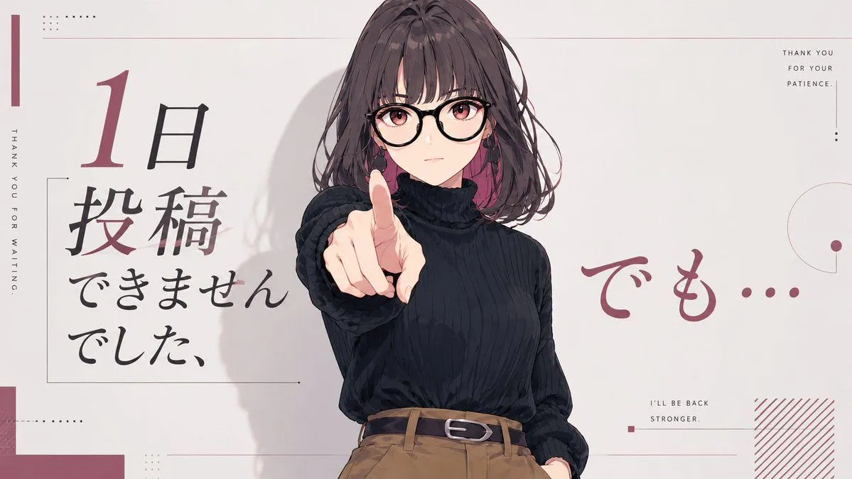
Anime Comeback Posting Banner
Goal: Create a clean 16:9 anime-style social media banner about taking a one-day break from posting but returning anyway. Canvas: Wide landscape canvas, pale warm off-white background, minimalist editorial magazine layout with muted burgundy accents, thin gray lines, small dot grids, and lots of negative space. Main subject: A half-body anime illustration of character_description. Place her slightly right of center, facing the viewer. Her right arm reaches forward toward the camera with her index finger pointing directly outward, creating strong perspective foreshortening. Her left hand rests casually in a trouser pocket. Add soft painted shadows behind her and subtle hair strands around the face. Cover the upper face area with a large centered square mosaic/blur block in muted taupe, obscuring the face while leaving hair, ears, neck, and pointing finger visible. Layout and text: Use exactly 5 main text groups. 1) On the left, a large vertical Japanese headline in brush-calligraphy style reading left_japanese_headline, with the numeral “1” large and burgundy and the remaining Japanese characters mostly black. 2) On the right side, large burgundy handwritten Japanese text reading right_japanese_phrase. 3) Along the far left edge, small vertical uppercase English text: “THANK YOU FOR WAITING.” 4) In the top-right corner, small stacked uppercase English text: “THANK YOU / FOR YOUR / PATIENCE.” 5) In the lower-right area, small uppercase English text: “I’LL BE BACK / STRONGER.” Decorative elements: Include thin rectangular outline framing the left headline, a narrow burgundy vertical bar at the far left, tiny dotted square patterns near the top-left and lower-left, thin horizontal divider lines across the top and lower middle, a small burgundy square near the lower-right caption, a partial thin circle and dot motif on the right edge, and a burgundy diagonal hatch block in the bottom-right corner. Keep all decorations sparse and precise. Visual style: Polished Japanese anime illustration mixed with modern editorial typography; muted palette of off-white, black, charcoal, camel brown, and dusty burgundy. Soft lighting, clean linework, gentle cel-shading, no photorealism. Constraints: Maintain the same wide banner composition, keep the character centered-right and pointing at the viewer, include exactly the 5 text groups listed, avoid extra characters, logos, watermarks, or additional readable text.