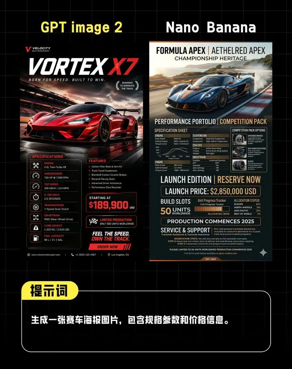
AI Supercar Poster Comparison
Create a side-by-side comparison graphic on a black background with a faint gray grid, styled like a Chinese social media benchmark post comparing two AI-generated supercar posters. At the very top, place 2 large headings: on the left in bold yellow text, “GPT image 2”, and on the right in bold white text, “Nano Banana”. Centered beneath them, show 2 distinct vertical racing poster designs placed next to each other with a narrow gap. The left poster should look like a dramatic high-end motorsport advertisement in black, red, and white, featuring a glossy red hypercar speeding on a wet racetrack at dusk with cinematic reflections, motion blur, and aggressive lighting. Include a small brand mark at top left, a giant title “VORTEX X7” with “X7” in bright red, and a subtitle like “BORN FOR SPEED. BUILT TO WIN.” Add 2 laurel-like badges on the right of the title area. In the lower half, include 3 content blocks: a left “SPECIFICATIONS” column with exactly 7 listed rows with icon bullets and labels for engine, horsepower, top speed, acceleration, transmission, drivetrain, curb weight, plus fuel capacity if needed as a compact final row; a middle “FEATURES” column with exactly 5 bullet points; and a bold pricing block with “STARTING AT” and a large red price of price. Add 1 limited-production badge, 1 slogan block reading “FEEL THE SPEED. OWN THE TRACK.”, and 1 red call-to-action strip reading “ORDER NOW”. Use tiny footer details and contact-style microtext along the bottom edge. The right poster should look more editorial and technical, in navy blue, charcoal, beige, and orange accents, featuring a dark blue hypercar drifting on a racetrack with smoke and landscape in the background. At the top, use a premium magazine-style header with 3 stacked title lines: “FORMULA APEX | AETHELRED APEX”, “CHAMPIONSHIP HERITAGE”, and a performance subtitle. In the lower portion, create a dense spec-sheet layout with exactly 8 major sections: “SPECIFICATION SHEET”, “COMPETITION PACK OPTIONS”, “ENGINE”, “SUSPENSION”, “CHASSIS”, “DRIVETRAIN”, “LAUNCH EDITION | RESERVE NOW”, and “SERVICE & SUPPORT”. Include a small performance graph, a boxed options panel with 3 icon cards, a launch price line showing launch_price, a build-slots area showing exactly 50 units worldwide, an allocation or progress tracker with segmented bars, a line stating production begins in production_year, and dense fine-print technical copy. Beneath both posters, add a rounded rectangular black prompt box outlined in white, spanning most of the width. Attach a yellow rounded label overlapping its top-left corner containing the Chinese text “提示词”. Inside the box, place one line of bold white Chinese text: prompt_text. The whole composition should feel like a polished AI image comparison screenshot for social media, with sharp typography, high contrast, clean alignment, and realistic poster mockup proportions.