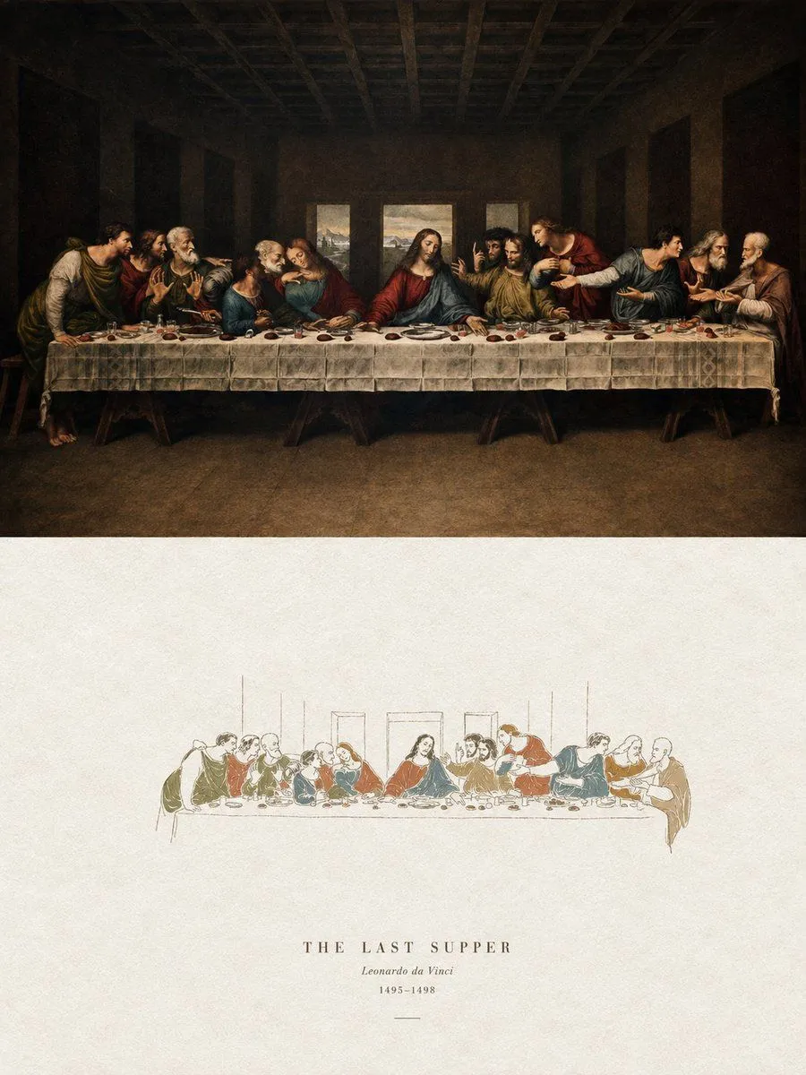
Acrylic Hand-Painted Style Poster Design
Please turn each uploaded photo into a separate high-end design poster. Do not combine images; each photo should be output individually. Use a composition_ratio vertical composition, divided into two sections with a strict 1:1 height ratio, each occupying 50% of the frame. The upper half preserves the original photo, maintaining the subject structure, authentic texture, natural lighting, and original color atmosphere, with only subtle high-end photographic color grading to give it a magazine photography and art publication feel. The environment can be naturally extended to fit the frame, but the subject must not be stretched or distorted. The lower half extracts the most recognizable subject, silhouette, posture, and narrative from the photo, reconstructing it as a minimalist paper-feel hand-drawn cover illustration. It should highly refine and reduce complex details, keeping only the most critical visual features, expressed with thin, slightly unstable hand-drawn lines and a few clear acrylic flat-painted color blocks. The subject stays small and concentrated, occupying about subject_proportion of the lower half, surrounded by large areas of white space. The background is primarily rough white or light-colored paper. The color palette is extracted from the photo and compressed into no more than 4 main colors. Color blocks are vivid, complete, and restrained, retaining paper grain and manual smearing. Lines indicate structure while color blocks establish the subject. Avoid colored pencils, crayons, watercolor, pure line drafts, heavy oil painting, or 3D textures. A small amount of simple text can be added based on the photo content, such as titles, keywords, or short phrases. The typography should be sparse and restrained, blending naturally with the white space for an art book or independent publication feel. The overall vibe is minimalist, high-recognition, quiet, and poetic, avoiding a commercial or template look.