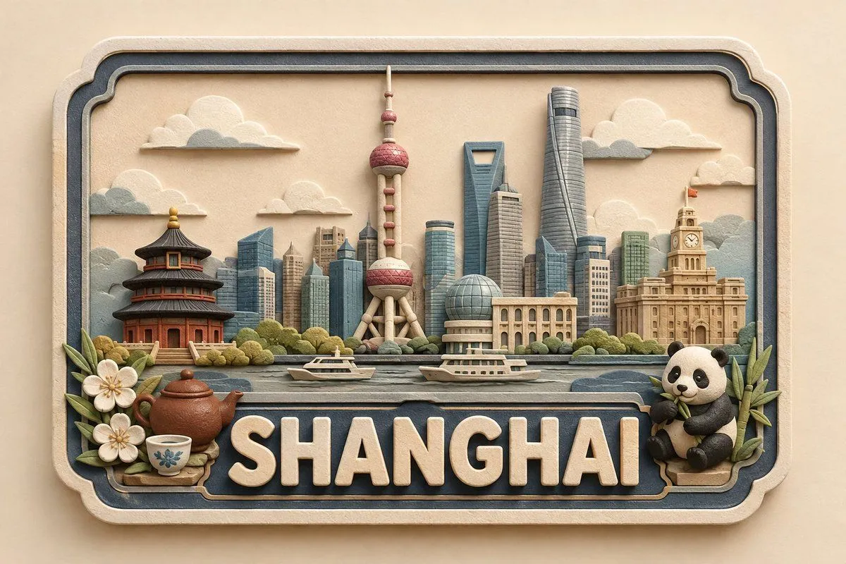
3D Paper and Clay Plaque
Create a premium, cute, handcrafted 3D paper-and-soft-clay destination plaque for location, designed as part of one consistent global collectible series. COMPOSITION & GEOMETRY: Use a fixed horizontal framed layout on a normalized 100%100 grid. Frame: x=5–95, y=8–92. Landmark zone: y=18–58. Foreground: y=48–67. Location-name zone: y=68–88. Bottom margin: y=88–92. Keep these proportions identical for every location. LANDMARK HIERARCHY: Place 1 centered hero landmark at x=50, occupying 34–38% height; 2 supporting landmarks at x=25 and x=75, each 22–28% height; 2–4 smaller background elements across x=10–90, each 12–20% height; and 1–3 subtle local foreground details, no more than 14% height. Use only the most recognizable and geographically appropriate features of location. Preserve defining silhouettes while simplifying details and avoiding clutter, clichés, or stereotypes. TYPOGRAPHY: Display exactly “location”, centered and unobstructed. The lettering should span approximately 82–86% of the plaque width and 17–20% of the canvas height. Use large, raised, embossed, rounded sans-serif lettering in warm ivory with a matte finish. Maintain consistent weight, spacing, alignment, and baseline across the entire series. MATERIAL & STYLE: Approximately 70% layered paper and 30% soft matte clay. Create a shallow-relief handcrafted appearance with visible paper fibers, subtle clay texture, rounded handmade edges, delicate layer shadows, and small natural imperfections. Avoid glossy plastic, metallic materials, photorealism, or a generic CGI appearance. COLOR PALETTE: Warm ivory/cream foundation, soft beige and natural paper tones, muted blue-gray secondary accents, plus minimal muted colors inspired by the specific location. CAMERA & LIGHTING: Straight-on centered camera with fixed perspective and scale. Use a warm neutral background, soft diffused studio lighting, gentle shadows, consistent depth, and subtle dimensional separation. No reflections, dramatic perspective, or surrounding environment. SERIES CONSISTENCY: Keep the frame, composition, grid, typography, landmark scale, hierarchy, object density, materials, palette, lighting, camera angle, depth, shadows, and negative space identical across every location. Change only the landmarks, culturally/environmentally relevant details, and restrained location-specific accent colors. FINAL QUALITY CHECK: location must be instantly recognizable, correctly spelled, visually balanced, and free of unnecessary text. Maintain the fixed landmark hierarchy, unobstructed lettering, consistent proportions, premium handcrafted texture, cute collectible aesthetic, and cohesive global-series identity.