Torn Paper Reading Poster
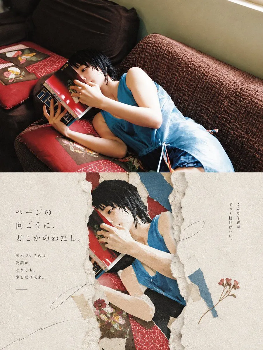
Goal: Create a vertical editorial poster combining a warm cinematic lifestyle photograph with a torn-paper collage aesthetic, centered on subject. Canvas: Vertical 3:4 poster, about 900 x 1200 px. Split the composition horizontally into 2 distinct sections: the top half is a full-bleed realistic photograph, and the bottom half is a cream handmade-paper design with a large torn opening revealing the same photograph underneath. Top section: Show the subject reclining diagonally on a textured brown couch near a window, wearing outfit. She is lying on red patterned cushions with small floral fabric patches, holding a glossy red book close to her face so it partly hides her mouth and nose. Her expression is quiet and absorbed, eyes visible over the book. Use soft afternoon window light from the upper right, warm shadows, natural film photography grain, intimate indoor atmosphere, slightly high camera angle. Bottom section: Create an aged off-white paper background with subtle fiber texture, stains, deckled edges, and handmade stationery feeling. In the center, make 1 large irregular vertical ripped crack/opening with rough layered paper edges, exposing a cropped duplicate of the woman reading beneath it. Add 4 torn colored-paper fragments around the opening: one red fragment near the top, one muted blue fragment at the upper right, one beige fragment along the lower left edge, and one dark fragment near the lower center. The exposed image should look slightly flatter and more printed, like a magazine photo embedded under torn paper. Text content: Add Japanese editorial typography in thin, elegant Mincho-style characters. On the left side of the bottom paper, large vertical/stacked text reads main_japanese_copy. Below it, smaller text reads small_japanese_copy. On the right side, add a small vertical Japanese note reading right_japanese_note. Keep the text sparse and airy, with generous margins. Decorative details: Include exactly 2 pressed dried flower sprigs: one small reddish flower cluster near the lower center-left of the torn opening, and one longer thin-stem flower sprig near the lower right. Add 3 faint pencil-like curved scribble lines across the paper: one large loose curve on the right, one short underline-like stroke below the left text, and one long sweeping line from the lower left toward the center. No logos, no watermarks, no extra text. Visual style: Japanese magazine cover, poetic paper collage, tactile torn paper, wabi-sabi stationery design, warm nostalgic color grading, realistic photography mixed with handcrafted paper texture, calm literary mood.