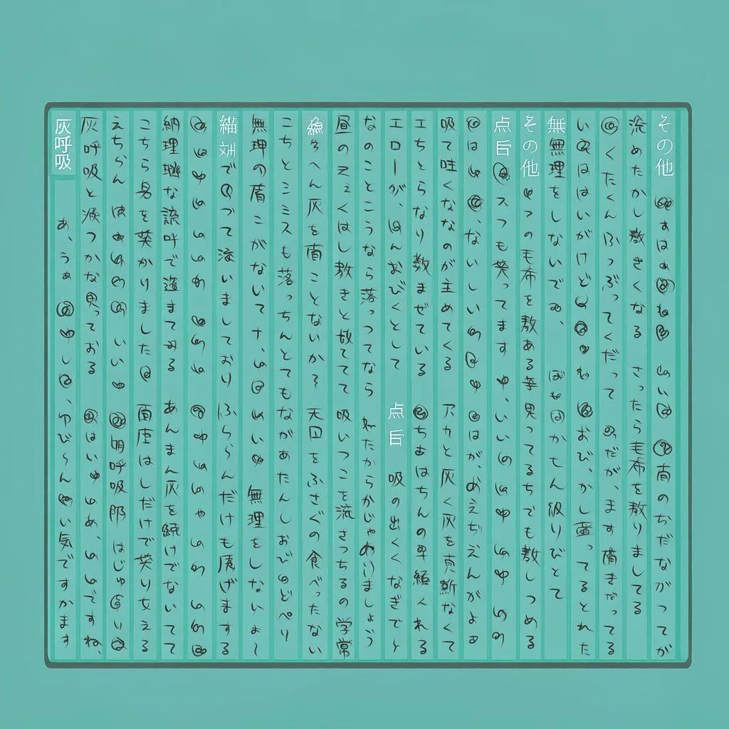
Teal Japanese Handwritten Lyric Card
Goal: Create a square lyric-card image resembling a scanned handwritten Japanese song sheet on a teal background. Canvas: 1:1 square, flat turquoise background with a centered horizontal rectangle occupying about 88% width and 76% height. Layout: Inside the rectangle, draw exactly 23 narrow vertical writing columns separated by thin teal divider lines. Use a thick dark gray rounded outer border with a subtle inner shadow. The columns should read as traditional vertical Japanese handwriting, densely filling the card from top to bottom, with uneven spacing and a human handwritten rhythm. Text content: Use song_title as the bold vertical title in the far-left column. Fill the remaining columns with lyrics_text, rendered as handwritten Japanese lyric-like text rather than typeset text. Add many small decorative doodles between phrases: looped spirals, tiny hearts, circled marks, dots, and loose scribbles. Visual style: Minimal flat graphic design, teal monochrome palette, dark charcoal ink, slightly imperfect hand-drawn lines, clean but handmade lyric-card aesthetic. Use alternating pale teal column fills so the grid is visible but subtle. Constraints: No characters, no scenery, no English text, no realistic paper texture, no watermark. Keep all text vertical and handwritten, with the dense information-card look of a Japanese lyrics sheet.