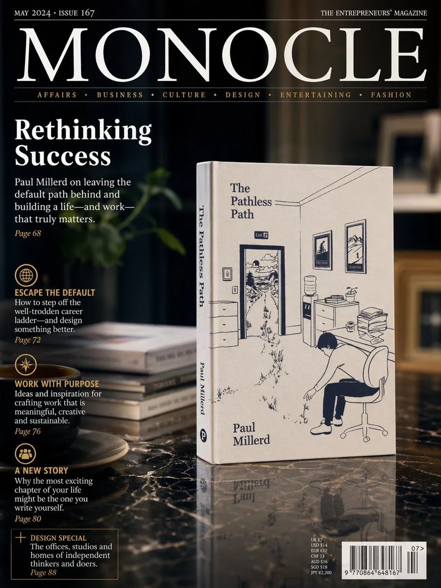
Luxury Magazine Cover With Featured Book
A photorealistic premium magazine cover in the style of an international design and business publication, shot as a sophisticated editorial still life. The cover features a dark, moody interior with shallow depth of field and warm ambient lighting. Center-right, standing upright on a glossy black marble table, is a cream-colored paperback book titled book_title by author_name. The book is angled slightly to the left so both the front cover and spine are visible. The cover illustration is minimalist navy-blue line art showing an office interior with an open door leading into a winding outdoor path, framed pictures on the wall, a water cooler, a desk with stacked papers, and a person slumped in an office chair. The author’s name appears near the lower left of the front cover, and the title also runs vertically on the spine. To the left of the book on the marble surface is a small stack of 4 books, softly out of focus, and in the lower-left foreground sits 1 dark coffee cup on a saucer. Behind them is a dim, elegant room with blurred shelving and a soft green plant shape in the background. The magazine masthead dominates the top: magazine_title in very large white serif letters across the width, with small white issue text at top left reading issue_text and small white tagline text at top right reading “THE ENTREPRENEURS’ MAGAZINE”. Beneath the masthead is a thin rule and a category line in small gold serif text with 6 categories separated by dots: “AFFAIRS • BUSINESS • CULTURE • DESIGN • ENTERTAINING • FASHION”. On the left side, large white serif cover headline text reads “Rethinking Success”. Below it is a white serif subheadline about leaving the default path behind and building a life and work that matters, followed by a small gold page number. Further down the left column are 4 editorial teaser blocks, each with a gold circular icon and gold uppercase heading, white descriptive text, and a gold page number. The 4 headings are “ESCAPE THE DEFAULT”, “WORK WITH PURPOSE”, “A NEW STORY”, and a boxed teaser “DESIGN SPECIAL”. At the bottom right is a realistic barcode block with small pricing text above it and a small issue number beside it. The overall layout should feel like a real luxury magazine cover mockup: crisp typography, elegant serif fonts, black, white, cream, and gold palette, glossy reflections on the marble, cinematic shadows, subtle product reflection beneath the book, and high-end editorial photography styling.