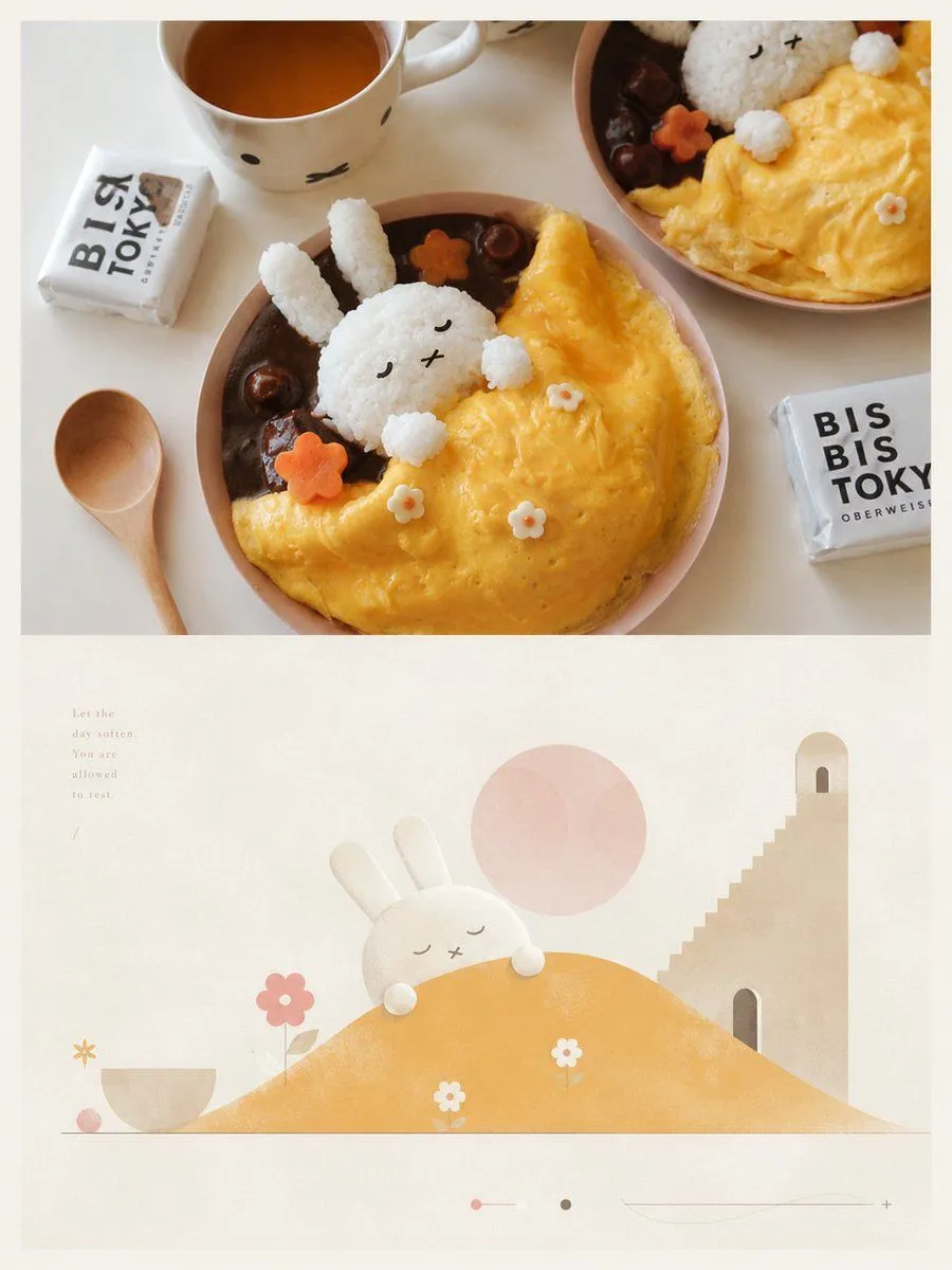
Geometric Abstract Dual-Layer Poster
Process the text with better logic: Create an independent high-end design poster for each photo I upload, not a collage, but outputting each photo separately. Use a 3:4 vertical composition, following a dual-layer logic: the upper part is realistic photography, and the lower part is an artistic reconstruction based on subtext and metaphor. The upper part preserves the original photo, maintaining the subject's identity, structure, posture, real texture, natural light, and original color atmosphere, with only slight professional photographic color grading to give it the quality of an art magazine, independent publication, or exhibition photography. The background environment can be naturally extended to fit the frame, but the subject must not be stretched, distorted, or changed. The lower part extracts the most recognizable **subject, outline, posture, narrative relationships, and emotional metaphors** from the photo. It shouldn't just recreate 'what is seen' but understand 'what the original image implies, symbolizes, or suggests,' then reconstruct it into a **visual_style** graphic scene. Do not fully depict the original scene or copy realistic details; instead, retain only the core theme and visual logic that represent the spirit of the original image. Translate complex information into a few clear and meaningful shapes, paths, landforms, architectural elements, spatial layers, or symbolic objects, making it instantly recognizable as originating from the original while feeling elevated with a sense of allegory and poetry. The composition should be built on **geometric order and rational structure**, possessing a Da Vinci-like rigor: emphasizing proportion, axes, perspective, primary and secondary order, surface relationships, path guidance, and spatial balance. The subject can be transformed into simplified mountains, buildings, objects, figures, roads, platforms, domes, arches, discs, tree-like forms, or other symbolic geometric shapes, using a few key elements to build a quiet and romantic 'conceptual landscape.' The lower part should have ample light-colored negative space and breathing room; complex backgrounds should be actively reduced, leaving only the necessary field to support the theme and metaphor, allowing the blank space, distance, and order to participate in the narrative. The visual language uses **geometric flat graphics + soft hand-crafted textures**: clear and summarized shapes, restrained edges, and simplified details, allowing for a slight paper, powdery, or printmaking feel, but avoiding sticker-like, 3D, realistic, or overly decorative looks. The overall image has the simplicity of modern graphic design and the poetic nature of romantic narrative illustration, like a dream map, memory landscape, or allegorical diagram constrained by rational structure. The color scheme follows the current logic: the overall use of a **color_tone**, with a very light, clean, near-white background as a large breathing field. Use **primary_colors** to create the main atmosphere, balanced with **ivory white, cream, light beige, soft gray-green, and architectural neutrals**; small amounts of **blush pink, soft peach, dusty rose, or muted blush** can be added as accents to make the image feel more healing, poetic, and refined in layers. Avoid muddy grays, excessive contrast, high-saturation color clashing, or cheap retro vibes. Text should not have preset titles, numbers, locations, or languages, nor follow a menu-style information layout. Based on the theme, emotion, metaphor, memory, or cultural context of the photo, freely generate a minimal amount of truly meaningful words, phrases, or snippets, naturally integrated into the negative space through high-end editorial layout. The text should be small, light, restrained, and exquisite, arranged along axes, edges, paths, or around the subject, like annotations or observation phrases in an independent publication, forming a quiet and clever relationship with the geometric composition. The overall vibe should be like an independently published art travel journal or a visual allegory manual: **minimalist, poetic, romantic, rational, restrained, with geometric order and conceptual beauty.** Avoid fully realistic landscapes, information overload, complex decorations, overcrowded subjects, overly solid backgrounds, templated poster looks, e-commerce illustration vibes, cartoonish styles, and cheap collage effects.