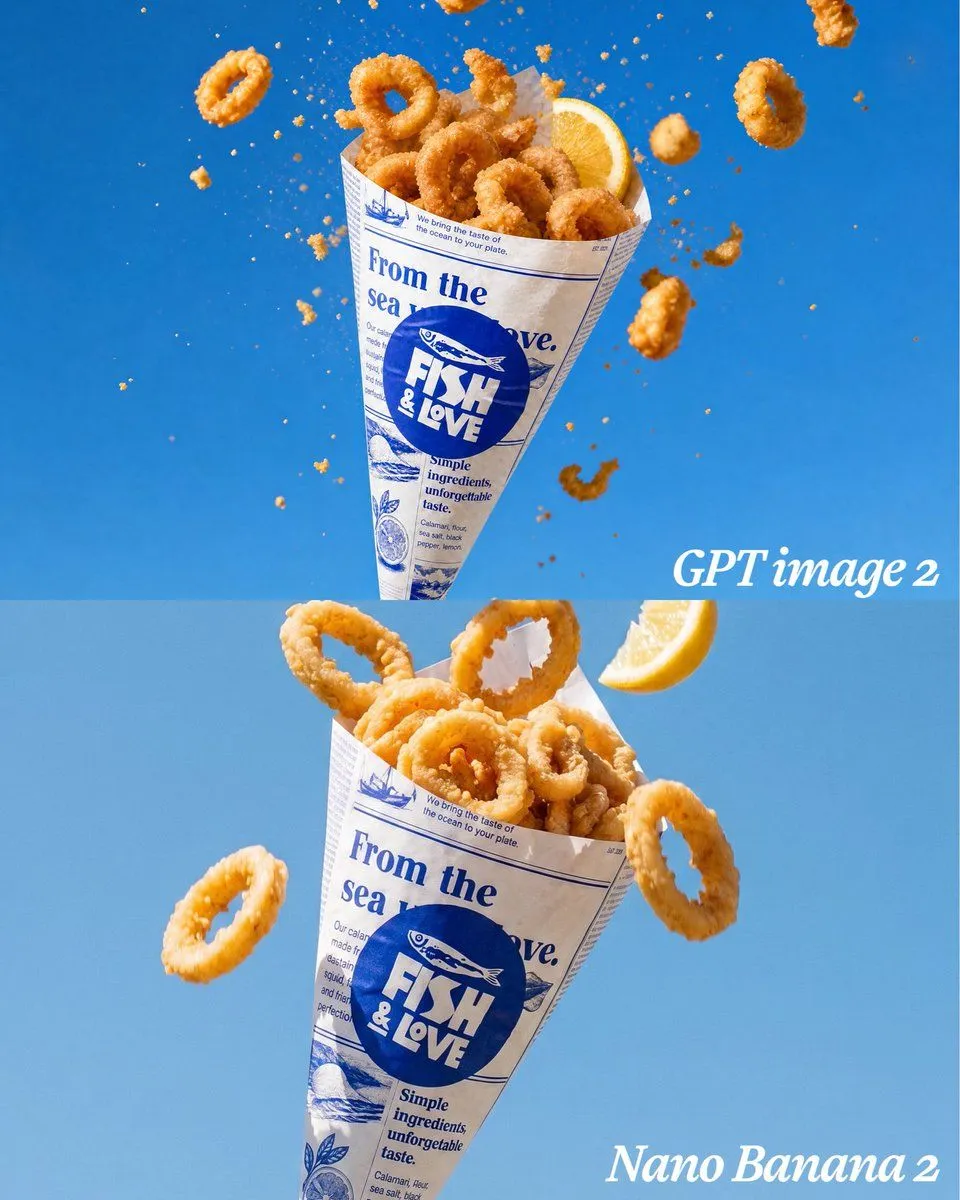
Calamari Cone Model Comparison
Goal: Create a vertical comparison image showing the same appetizing fried calamari cone rendered in two stacked panels, like a side-by-side model comparison but arranged top and bottom. Canvas: Square 1:1 image, 768 x 768 style composition, split horizontally into exactly 2 equal panels. Use a clean bright background_color studio background with a subtle gradient; the top panel is slightly deeper blue and the bottom panel slightly lighter blue. Layout: Top panel contains one floating paper cone of fried calamari centered slightly left, tilted upright, surrounded by airborne crumbs and flying calamari rings. Bottom panel contains the same paper cone larger and closer to camera, centered slightly left, with a few flying rings and a lemon wedge. Add a white italic serif label reading top_label near the lower-right of the top panel, and another white italic serif label reading bottom_label in the lower-right corner of the bottom panel. Subject details: The food is golden crispy fried calamari rings with rough crunchy breading, photographed as high-speed food advertising. Use exactly 2 lemon wedges total: 1 tucked into the top cone at the upper right, and 1 floating near the upper-right of the bottom panel. Use exactly 34 prominent calamari rings total: in the top panel, 18 rings, with 10 piled inside the cone and 8 flying around it; in the bottom panel, 16 rings, with 13 piled inside the cone and 3 flying outside it. Add many tiny orange breadcrumb particles and a few broken batter fragments suspended in midair, especially dense around the top cone. Packaging: Each cone is made from off-white faux newspaper paper printed in blue ink. The main circular logo on the cone reads brand_logo_text with a small fish illustration above it. Large blue newspaper headline text on the wrapper reads wrapper_headline. Include smaller decorative seafood-newspaper details, thin blue rule lines, tiny columns of filler text, simple fish and lemon illustrations, and the phrase "Simple ingredients, unforgettable taste." on the wrapper. The top cone is slightly smaller with more dramatic exploding crumbs; the bottom cone is larger, more polished, and has clearer wrapper text. Visual style: Ultra-realistic commercial food photography, crisp texture, sharp focus on calamari, high-speed freeze-frame motion, bright natural highlights, appetizing warm orange-gold food color against saturated blue, shallow depth of field, clean advertising composition, no people, no plates, no extra objects, no watermark.